|
Some aspects of advertising are timeless, but a lot has changed. Some of what I describe in the following paragraphs will seem very primitive!
To begin with, of course, there has to be an idea. Perhaps the copywriter would come up with a headline, or the art director had an image in mind. In either case, a collaboration between them would produce an image with a headline to suit. For the Schweppes campaign, for example, a young copywriter named Riva Fine and I would think up ideas together, she would write headlines and I would rough them out. You generate a lot of material and then skim off the best. We would do rough after rough just to get the flavor of what we were after, after discussing it with the principals who were working on the account.
Next the art director would do a rough rendering, blocking it out. The art director, the copywriter and maybe the account manager would talk over the results. The art director would then finalize the rough form and the copywriter would write out all the ad copy ("copy" is the term for ad text). Then you'd assemble the final layout. The whole thing would be mounted in the bullpen and made to look very polished. Finally, the account manager would take the finished ad to client.
|
LayoutLayout is the term for designing the way a page looks. It is the work of positioning the elements - the picture, the copy, and the logo - onto the page.
I knew nothing about layout when I started. My mentor Art Cady taught me by showing me, for example, how Life magazine was laid out. If you open a magazine, you will see the placement of pictures of various shapes and sizes - big, small, rectangular, square - but I saw that a well-designed page was basically simple to look at, even when it was packed with a lot pictures. The text, or copy blocks, is always neat; and the use of white space is absolutely essential to good layout. If you abstract the pictures and text on a page into just black blocks, then you will see the white space emerge and understand the balancing role it plays.
In layout, you would try to get overall compositional balance. This is intuitive, it's not a science. It's a matter of feeling. In any case, that's the way I learned it from Art Cady.
|
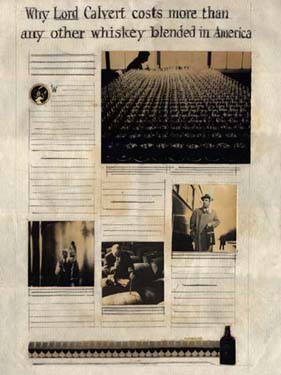
RenderingToday an art director can all put together all the components and do a whole ad in minutes on a computer. In those days, the art director would begin by sketching out the preliminary design, designing it roughly with pencil or charcoal. Then the letterer would hand-letter the headlines and the sketchman would do the artwork, unless the art director did this himself. Usually then this early version would be sent out to the client.
Here's a rendering I did for a Lord Calvert whisky newspaper ad (the ad actually never ran):
|
 |
TypeBack then you'd rule out the lines by hand, with width and height, and specify the type and size, for example, "Caslon, 12 pt." Then, you would actually send your copy out to a type house - an outside company which handled this sort of thing. There were messengers to deliver them back and forth. It would take several hours, or, often, I'd send it out at the end of the day and have it on my desk first thing the next morning. The typographer was someone I knew well - I talked to him all the time.
When you got it back from the type house, you'd cut it out and paste it into the rendering. If it didn't fit, of course you'd have to send it back out again - and wait.
If you haven't already seen examples of ad campaigns which illustrate the creative process,
take a look at Schweppes or the Commonwealth of Puerto Rico campaign, including tourism and rum.
|